
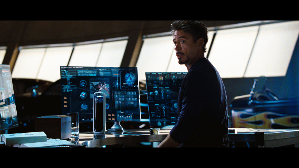
I’ll be the first to admit, we knew nothing about designing and producing a physical product when we started KOR. Both Paul Shustak and I were from the digital world and had developed websites and software, but nothing that you can touch, hold, and feel. Back in 2006, when we started the KOR ONE project, we didn’t know what we didn’t know. Looking back, and after releasing dozens of following products, it’s easier to see the forest from the trees. But launching the KOR ONE taught us what we believe are the 5 most important (but not-so-obvious) lessons from product design. Oh yeah...along the way Tony Stark (aka "Iron Man") decided he needed a KOR ONE too. That's the ultimate compliment.
1. Start with a Beginner’s Mind
We hesitated jumping in the hydration industry because we knew absolutely nothing about it. However, It’s really hard to discover new insights when you’re already immersed in the existing industry or product arena. Most breakthrough ideas come from the outside and there’s good reason for it. Innovation is often a response to a problem or frustration others have missed or simply endured. This “Beginner’s Mind” is an incredible asset when seeking to disrupt the conventional norm and create something special. Certainly, not knowing what you’re doing can cost you more in time and money, but when properly channelled, “seeing with new eyes” what others miss can give you a significant advantage.
Here are two of the many benefits we enjoyed as “outsiders”:
Look across industries for design innovation
Most companies at some point get myopic and can’t see beyond their own set of competitors and industry dynamics. That’s short-sighted but somewhat understandable. It takes more time, planning and expense to incorporate ‘design thinking’ and look across industries. This issue is rampant in business and so well chronicled in Clayton Christensen’s book, “Innovator's Dilemma.”
If the bottle we wanted existed, we wouldn’t have gone to all the trouble starting our own company. We wanted a beautiful, provocative bottle with intuitive and seamless functionality. Regarding the bottle aesthetic, most reusables looked like camping bottles. They were utilitarian and basic. While bottled water was under attack for the fact 4 out of 5 empties get tossed in a landfill (or set adrift in our oceans), it’s no surprise people weren’t rushing to buy a canteen-looking reusable bottle. Consider also the concern over tap water. Bottled water companies told stories of the exotic locations of their source (anyone been to Fiji?). The bottles were upscale with beautiful packaging. How do you compete with that?
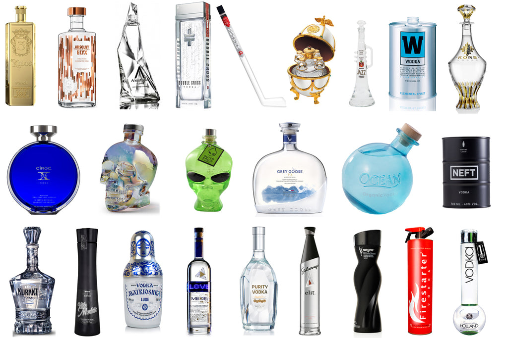
We began researching liquor bottles, particular high-end vodka bottles. In the liquor industry, the design of the bottle forms the brand as much as the contents inside. In a bar, the aesthetic design of that bottle sitting on the shelf becomes the ambassador of the brand. Perfume bottles are similar. The shape, color, logo, and packaging sell you before you’ve even tried what’s contained in the bottle. If we wanted to defeat bottled water and win over users, we needed to be aware of the placebo effect at work not just with water but across other industries like spirits and perfume.
Start with a blank piece of paper
Without knowing the constraints, Paul and I pursued what we now realize were outrageous and provocative design challenges. And because we didn’t know the limits, we were able to blow through preconceived design barriers and find the real outer limits. Having both worked in software where requirements definition is a necessary and painstaking process of documenting features, we showed up to our first design meeting with almost 100 bottle requirements. Once the design process started, many of our “musts” became “maybes” which were further downgraded to “nice to have but not importants”, but a lot of design innovations came from starting with complete removal of constraints. When we bumped up against a wall, we pushed on it, and while many didn’t move, some of these walls were merely locked doors for which we found the key.
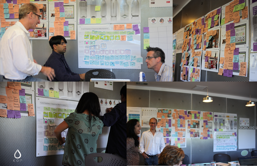
So whether it’s your first project or your hundredth, we’ve found it invaluable to release yourself from the past, or rules, and step into the discovery process as if it’s the first thing you’ve ever done.
2. You Might Need a Product, But I’d Rather You Want It
There’s a big difference between “Need” and “Want”. Need products are ones that fill the basic functional need we’re pursuing and do a decent job for a reasonable price. Want products are just that - you WANT the product, not just because you NEED it, but because there’s another dimensional field at work that compels you to the product. That might be your love for the design or the brand. It might be what that product will say about you when you have it, or rather, how that product makes you feel when you have it. That was a key insight we learned from our partners at RKS Design. Want products can go places Need products never will; they can be priced higher, have greater shelf lives, and create separation from a crowded market where your competitor’s products are merely functional substitutions for one another. The world needs both Need and Want products (pun intended), but I’d rather be in the Want business. It’s harder, but the dividends are greater.
3. Surround Yourself With Great Partners
Duh. This is not breaking news, but the importance of building a team great partners cannot be overstated. When you screw up or fall short, which you will often, the measure of your partners will determine whether your design project stays on track or never sees the light of day.
Our vision for the KOR ONE kept growing as we talked on and on about the idea of this bottle. And as that vision grew, we realized that two guys with limited resources couldn’t pull it off alone. While we were short on funds, we were rich with enthusiasm, confidence, and an irresistible story about how our bottle could change the world.
The first, and most critical decision, centered on our industrial design partner. This choice would determine which path our vision would take as thought and matter came together to create our bottle. We interviewed several design freelancers and design firms, but it was a chance encounter of seeing RKS Design on the cover of BusinessWeek Magazine in July 2005 that led to our longstanding collaborative partnership. At the time we were leaning way over our skis. Who were we to think we could get RKS to sign on to our project? They were globally recognized with a wall filled with design awards and accolades - we were two guys with and idea. As luck would have it, RKS was located only a 2 hour drive north of LA, so we jumped in the car and went up to pitch our idea. Ravi Sawhney (CEO of RKS) sat in on the meeting and immediately got it. We wanted this KOR bottle to be a transformational object, something that weaved sustainability and a personal narrative of change and reverence for water. We talked that first day about wanting to “celebrate and treasure” water - to put water on a pedestal with this bottle - and that formed our North Star design motivation from day one. RKS exposed us to their innovative “Psycho Aesthetics” design process, in which just like Joseph Campbell’s “Hero’s Journey”, we thought deeply about the story of our user (which led to the KOR and RKS being profiled in an Harvard Business School case study). Paul and I chose RKS not because they were on the cover of BW, but because they understood the soul of our idea in a way that gave us confidence our bottle would fulfill that promise.
When you build a team of great partners, it also spawns a “network effect” in which other amazing people and collaborators begin appearing. Paul and I had done exhaustive research on the problem and bubbling online discussion surrounding bisphenol-A (aka “BPA”), a hormone-disrupting chemical used in hard plastics like polycarbonate. Most clear reusable bottles in 2007 were still made from polycarbonate (containing BPA), including by industry leaders Nalgene and Camelbak. And while we intended to make a clear, plastic reusable bottle, we knew we could not make it from polycarbonate. RKS, through its work with Eastman Chemical on prior projects, shared that a new BPA-free material was in development at Eastman. It’s what was called a “co-polyester”, and the material would deliver beautifully clear, translucent appearance with strong durability and not contain BPA. We were connected with Gaylon White at Eastman, an inspirational champion of design who also immediately seized upon KOR’s dream of a design-driven reusable water bottle. Gaylon opened a world of resources, technology and marketing support from Eastman and we quickly grew to become great friends. He’s the kind of guy you want in your corner, not just for our project, but for life. KOR was a close 2nd to releasing the first reusable water bottle in what became known as Tritan (Camelbak switched over from polycarbonate to Tritan before we could release the KOR ONE). Today, almost all food-grade plastic containers, including reusable bottles, are made out of Eastman Tritan.
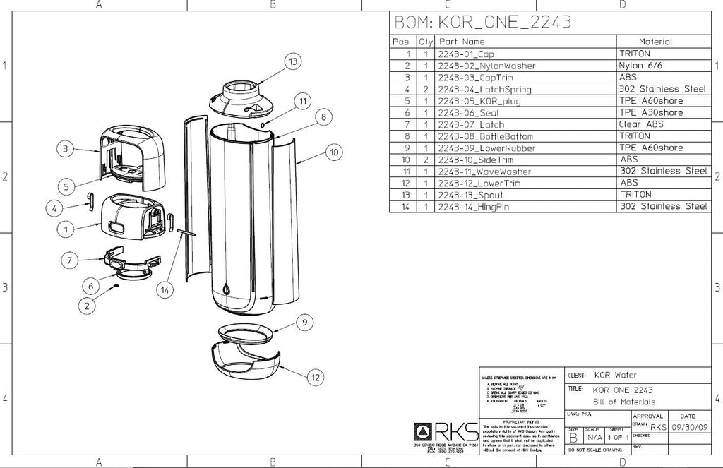
The third leg of KOR’s grand partnership came through our search for a manufacturer. After completing the design and prototype for the KOR ONE, it took us another year to raise the nearly $200K we needed to tool and produce the bottle. But who could make it? We wanted very much to produce the KOR ONE in the US, but finding the right balance between expertise and cost was extremely difficult. Our friends at Eastman recommended Nypro, a Boston-based US manufacturer that had plants throughout the US and the world. Nypro was the perfect choice, and together we settled on producing the KOR ONE in their Monterrey, Mexico facility because of their injection molding expertise making highly precise and technical parts (think Blackberry and Nokia cell phones). Some might argue the design for the KOR ONE was overengineered (it has over 15 parts), but it’s manufacturing complexity is hidden in the simple organic and beautiful final form.
It took months of work with Nypro to translate the CAD into workable parts and ultimately a final product. If it wasn’t for the brilliance and effort of Jon Rolland, an engineer with whom I befriended at Nypro, the KOR ONE would most likely never have come into existence. Jon, like Gaylon and Ravi before, became invested in KOR’s story and were invaluable to launching KOR.
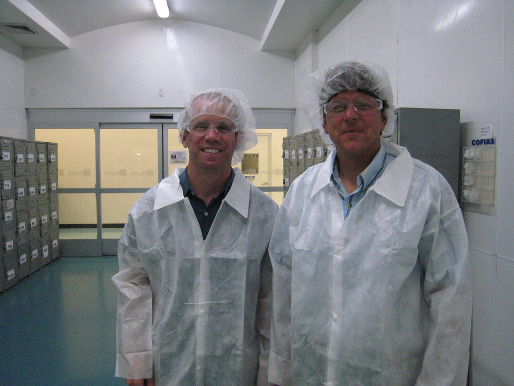
In all my business pursuits, I’ve never had a better team of partners that put everything on the line to make a project happen.
4. Ideas are Easy, Execution is Hard
We’ve all been there. Some new product or idea is launched and we tell our friends that we had that idea already. There’s a false sense of accomplishment in telling someone your idea as if that was the same as actually making it happen. But let’s be clear, an idea and the execution of that idea are galaxies apart. I speak from experience having stopped short repeatedly on the path of execution.
The idea of creating KOR held such gravity that somehow Paul and I found the patience to settle in for the long haul. Little could we predict our expected one year product design project would extend over three years. After achieving the “form” of the KOR ONE in 3 months, we spent nearly 18 months working hard on the “function”. We ran out of money on multiple occasions. We were told by several manufacturers that our bottle could physically not be made - that it was a unicorn. Several times, we even had to stop working on KOR and do other work (like earn a living), but we kept coming back to KOR and feeding it bits and pieces of our soul.
I can remember having the opportunity to present the pilot samples of the KOR ONE at the Art Center “Serious Play” design conference (entitled “Serious Play”) in 2008. The samples were buggy and the cap didn’t open and close properly. There I sat with a set of pliers and sandpaper for 7 hours, filing down the clips and bending the leaf springs that secured the cap. I yielded 3 or 4 bottles, but just enough to pass around at the conference and catch the eye of Minda Gralnek, Target’s Chief of Design and Bruce Nussbaum, who covered design at BusinessWeek. The KOR ONE was turning heads, and that’s probably the first real indication we had a hit.
The idea comes first. But after the research, design, prototyping, testing, funding, and manufacturing, your product must be priced, positioned, marketed, sold, displayed, and find its way into the hands of your audience. Along every point of this continuum there are multiple opportunities to fail. Execution is really, really, really hard. Executing something meaningful is once-in-a-lifetime hard.
5. Put a Brand On It
So many creators develop a product and stop right there, never thinking about what comes next or what the product says about who they are. In fact, spend a few minutes on Kickstarter or Indiegogo and you’ll find countless projects for single products where I’d suggest the brand has yet to be even considered. It took everything we had to design and launch the KOR ONE, so the idea of developing a full-on brand for KOR now seems laughable. But that’s exactly what we did, and that’s made all the difference.
A product is one single encounter between a user and its creator. Like a point on a graph, however, it lacks depth or breadth or sense of direction. A second product could certainly give two points, conveying a trend, but it still avoids exposing the soul of its creator. Brands deliver a full technicolor experience, where the “why” behind a product is present. The “why” allows you to unpack a story that’s started but unfinished and one your user is invited to co-author. Brands deliver both a reason for today and the excitement and expectations for tomorrow.
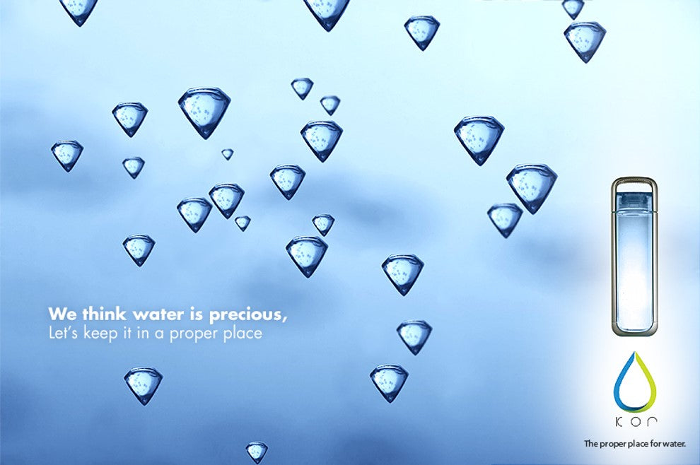
We chose the name KOR for a very particular reason. Sure, we were just making yet another reusable water bottle, but tugging on the “why” revealed that our bottle was a user’s message to the world:
- I drink water because I want to be healthy
- I drink from a reusable water bottle because it’s my choice to protect the earth
- I’m drinking from THIS reusable bottle because it’s beautiful, functional, and I believe in what this company stands for
This understanding opened up an entire landscape from which to develop the brand of KOR. The name, KOR, is a play on the word “core”. Personally, we recognized that drinking water to be healthier a manifestation of improving ourselves. We personally chose a reusable bottle over bottled water not because we felt guilty, but because we inherently wanted to celebrate water and the earth. The balance we sought each day in ourselves was likely present in most people. Our logo, which depicts a water drop made of two identical sides, represents the duality between the self and other from which we experience life. It was created by yet another wonderful soul we met along our journey, Jorge Hernandez, who masterfully absorbed our vision and translated that into KOR’s logo and wordmark. Both sides reach toward the top to connect, but the gap acknowledges our constant state of ‘brokenness’ - of being a work-in-progress. Within the sustainability movement, we didn’t want to be another nagging voice saying “you need to do better”. We wanted to say, “It’s OK. We’re all imperfect and seeking balance. If you fall down, just get back up and try again”. That’s a message neither here nor there for a functional water bottle, but we wanted KOR to be a brand that spoke to where people were.
Nurturing and codifying a brand gives you a much broader creative canvas. A brand is not concrete, so you’re free to develop it and move around over time. It’s an unfinished story but gives both you and your users space to hold together. And certainly, in a world that has everything but is starved for meaning, a powerful brand behind your product can transcend the direct functional purpose and become part of your user’s story.
So go ahead, put a brand on it.


I WILL LOVE TO HAVE ONE OF THEASE BOTTLES THEY ARE REALLY NICE.
Beautifully poetic story! Love how you transformed this company and excited to get my order. I am giving up plastic water bottles, bags and such. This is where I will start my journey into a healthier lifestyle with a better drinking source.
thank you
Blessings
Theresa M. Fairbanks